Blue is the worldwide most liked colour.

Recently blue has been confirmed as the most liked colour worldwide, followed by red and green. It is a colour which has played an important role in art, architecture and fashion too.
It is also the typical summer colour, a time of the year during which se stay on the fresh air and by the seaside and where the houses have their interiors often decorated with this colour.
But what is so special about this colour that is so much liked? Here a bit of history.
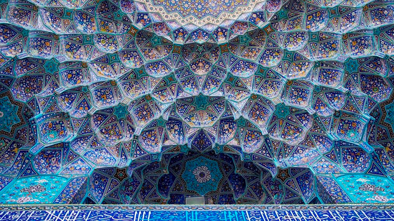
In arts, it has had alternating phases. It played a fundamental role during the Egyptian time, but Greeks and Romans disliked it; it will regain the scene in Europe during the Middle Age and since then the colour has played a very important role, for example in the paintings of the expressionists.
It has a very fascinating and evocative history.
Always associated to the vastity of the sky and the sea, it symbolizes life and divinity. Because of the difficulty in obtaining it, it has always been considered very precious and therefore synonymous of regality.
Let’s take a closer look at the many different shades of blue we find in arts.
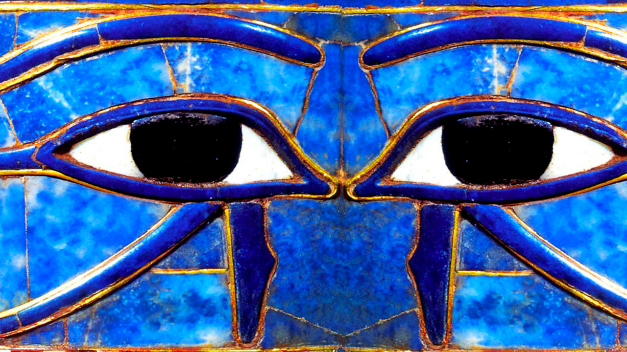
We start with the EGYPTIAN BLUE, that we find in the sarcophagus of the mummies or in the frescos of the pyramids. The colour is obtained through the heating of the combined silica, malachite, calcium carbonate and sodium carbonate. The result is an opaque blue glass, which is then crushed and mixed with a thickener, like the egg white, to obtain a paint which can be reduced in a colour powder. It is the first synthetic pigment in history.
Another blue, an inorganic pigment, is the ULTRAMARINE BLUE which result from mixing sodium and aluminium silicates. In ancient times this colour was obtained from the crushing of lapis lazuli of which Syria, Palestine, Egypt and most of all Afghanistan were rich. It is for this origin that this colour was considered a very precious one.
It arrived in Europe thanks to Italian merchants. For its preciousness it will be used mainly in religious pieces of work, to paint the sky (symbol of divinity) or the cape of the Madonna. Beautiful examples of how this colour was used are La Cappella degli Scrovegni by Giotto (1303-1305) or La Cappella Sistina by Michelangelo (1508-1512/ 1536-1541).
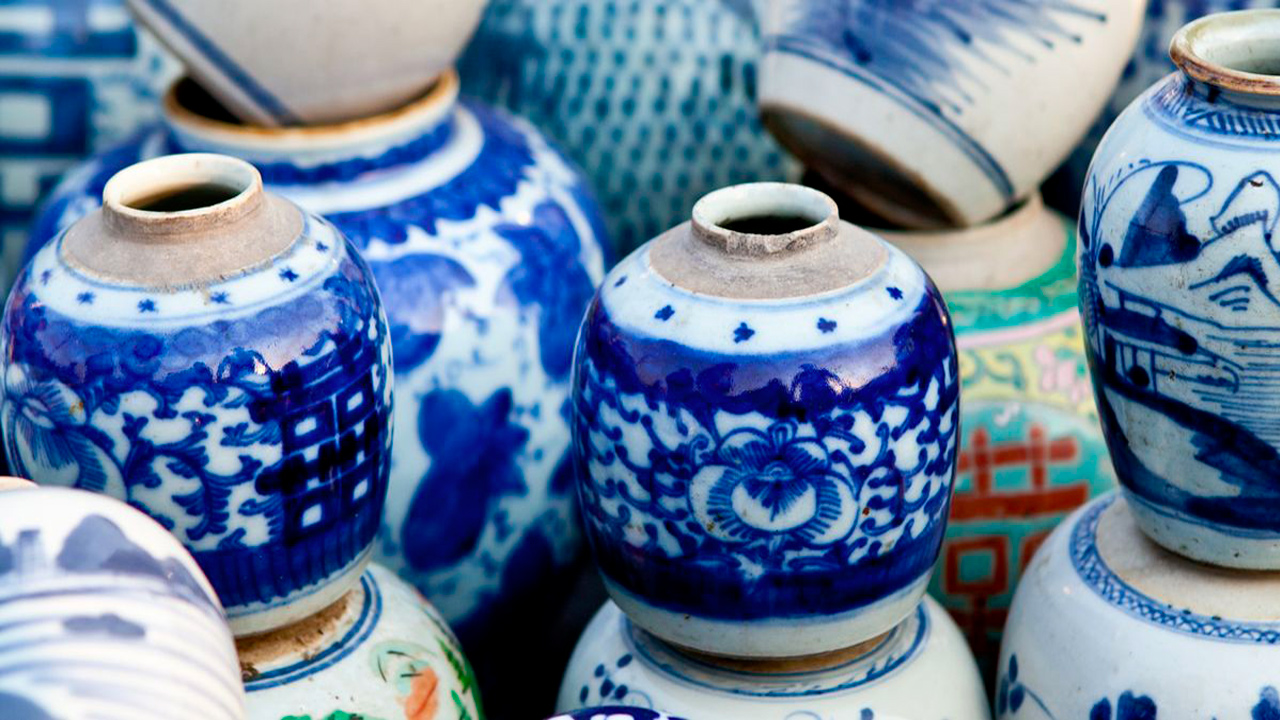
COBALT BLUE is a colour we encounter for the first time in the VIII and IX Century and which has been synthesized in France since the XIX century as an alternative to the Blu Oltremare, extremely expensive. It is the result of a mixture between cobalt and alumina salts. It is an intense and deep colour. It is particularly known for its use in the Ming ceramics.
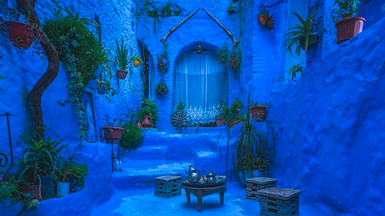
INDIGO BLUE opens the doors to the large use of the colour blue not only in arts but also in the textile industry. Since then, blue is not a rare colour anymore. It is a natural pigment derived from the leaves of the Indigofera tentoria, a plant of Indian origin that will revolutionize the textile world. It is a colour that can be used at large, an example is the “Blue town” in Morocco.
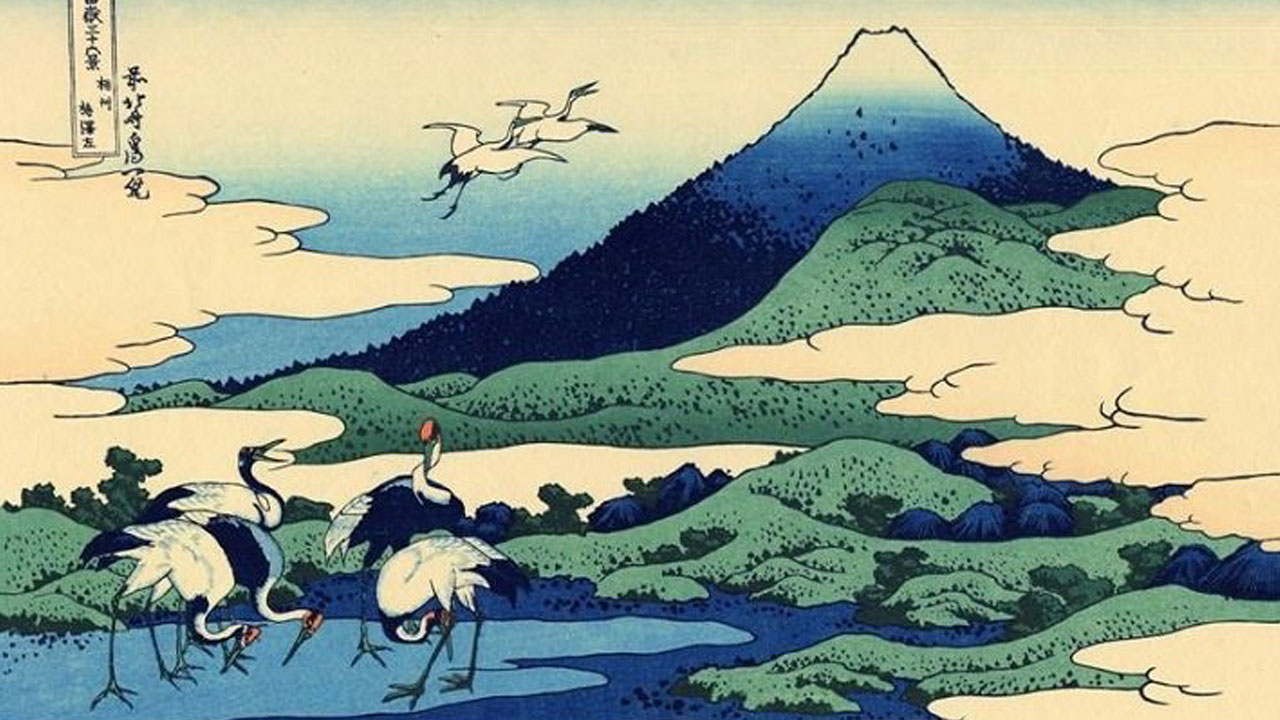
We also have the PRUSSIAN BLUE or Berlin blue, discovered by chance, mixing potassium chloride with animal blood. Once again it is a vibrant deep blue, which became famous thanks to the artist HOKUSAI, who used this colour in his famous woodcuts of WAVE OFF KANAGAWA and the many art pieces dedicated the mount FUJI.
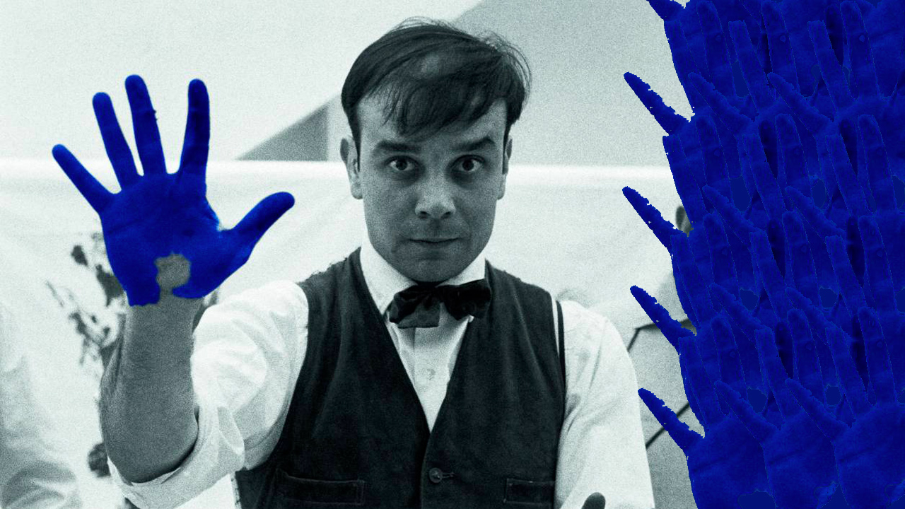
Finally, a last blue, the most recent one, the YVES KLEIN BLUE or IKB (International Klein Blu). It is a modified ultramarine blue. The artist has almost dedicated his entire life in searching this tone of blue defining it as follows: “Blue goes beyond any dimension”.
This artist is famous for his monochromatic pieces.
Talking about blue in interiors, it is perceived as a neutral colour and can be matched with almost any colour. It is interesting to see how, depending on the matching, it creates very different results. > The Classic Blue, a timeless shade chosen by Pantone as the colour 2020 instils calm, confidence and a sense of connections. In interiors it will perfectly match with natural colours, earth tones alike, brown, burnt, rust or Terra di Siena.
In psychology blue is identified with quietness and represents the mind. In chromotherapy is a peaceful, relaxing, introspective colour, which removes states of anxiety, stress, insomnia and irritability and a mood enhancer.
Therefore, we suggest to use it, in different shades, in a bed room or a bathroom, in a studio, but also in a living space thanks to its characteristic of mood enhancer, it will be perfect in convivial environments.
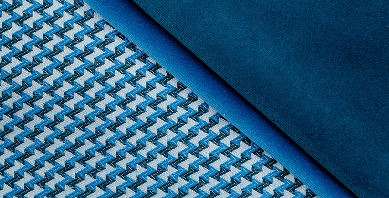
It is a colour that can be used as mural paint, on the furniture or as home accent using deco textiles.
Finally, one last curiosity, the etymological definition of BLUE as defined in etimoitaliano.it:
“The etymon of the word blue derives from the proto-Indo-European bhle-was. The root bhle- besides blue means also “the colour of light”. From the same root derive the latin word blavus=faded and the German word blao=blu”.
