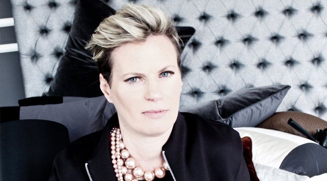
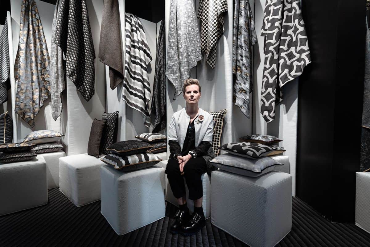
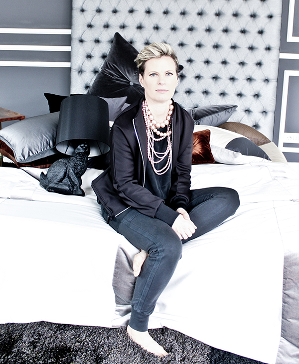
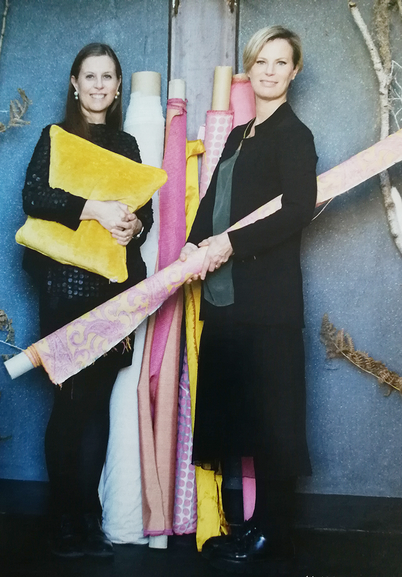
Barbara Bertoldo tells about herself and her work through the colors in the interview of the blogger Carlotta Berta at the Salone del Mobile in Milan

It has been established that colors have a great influence on the mood and on the psychophysical state of people. Our brain suffer the impact of their different shades activating different chemical reactions that can increase or decrease the production of hormones by stimulating emotions and moods such as sadness or cheerfulness.
The “power of colors” is used in chromotherapy, an alternative medicine that uses colors as a therapy for the treatement of diseases. According to the supporters of chromotherapy, colors help the body and the psyche to find again their natural balance and they have physical and psychic effects that can stimulate the body and calm certain symptoms.
In the same way this concept can also be applied to marketing: in a famous study of 2006, called “Impact of Color in Marketing”, the researchers have shown that the 90% of decisions about the impulse on the purchase of a product can be conditioned by the colors.

Barbara Bertoldo, creative director of l'Opificio, in the interview of Carlotta Berta, published on her Blog unprogetto, at the company's stand at the Salone dl Mobile in Milan, shows a great attention and attraction for colors both at work and in her private life.
The designer begins by underlining how the colors are essential from the early stages of her creative process which, says the designer, is given by the combination of her theoretical knowledge, obtained thanks to studies at the historical Institute of Art for Fashion and Costume in Turin and hers twenty years of experience in the fashion industry, and of sources of inspiration that are often varied and random.
Then color returns protagonist when we move on to one of the last phases oh product design, of which the designer personally cares with her sister Paola: the color's selection, which is very important to maintain the value of l'opificio's collections high.

Purple, orange and green, three strong colors, through which Barbara Bertoldo, perhaps unconsciously, tells about herself and her job.
Purple is the color of the spirit, connected to intuition, it stimulates the right cerebral hemisphere, the one devoted to creativity, to artistic inspiration, to imaginationand meditation. It is born from the union between red, which, on one hand, is the color of love, on the other, it is the color of fire and so can represent heat, energy and light, and Blue, which is a color that indicates calm and freshness.
Orange is the result of yellow, bright, and red, unbridled. It is the color of energy, of heat, of happiness and of renovation. It brings joy and enthusiasm, it stimulates creativity, liveliness and optimism.
Green is in absolute the color of nature. The green years are the young years, which bring to mind freshness, spring and rebirth. Green is a symbol of stability, balance and harmony. It also encourages reflection and concentration.
We find Barbara Bertoldo's passion for color also at the end of the interview. The designer gives us a taste of her house and describe her collection of vases. It is a composition of glass vases of many different colors that Barbara has accumulated over time and that she matched for heigh, size and color, as if it were a destructured painting that has become hers reason of pride.
Once again color is at the center of the designer's life who turned her passion in her job.
