NaN€

NaN€

Discovering colors

Yellow

Each colour has its own vitality and there are many ways to define each shade with beautiful words.

In interior design, the use of colour goes far beyond the harmony that a well-composed palette can convey.
 
To know: the mood and the psychophysical well-being of people are influenced by the colours surrounding them because colours stimulate, from a sensory and visual point of view, thanks our limbic system, that area which processes emotions and other brain areas more related to perception and decision-making.

To know: the colours that our eyes capture are nothing but light, photons that our brain transforms into virtual perceptions, emotions that can stimulate positive or negative energies, arousing curiosity, appeal or indifference and repulsion.

Yellow, with red and orange, is a warm colour opposed to the range of cold colours that is blue, green and purple.
 
According to the psychology of colour yellow conveys happiness, good mood. The wearer has a strong personality and loves to be around people. It is the colour of the sun and for this reason it is a symbol of vitality, optimism and rebirth.
 
Yellow is the closest colour to light (white), is centrifugal and radiating, refers to an accumulation of energy, has balance, mediation, joy, openness and vitality.
 
This colour causes our brain to release more serotonin and therefore to instil a deep feeling of psycho-physical well-being.
 
That is why Yellow is the colour of sun, happiness and good mood. Yellow has the power to accelerate our metabolism and tease creativity.
 
The golden Yellow (yellow ochre) in particular, symbolizes the divine light and the flame of wisdom. The shades that lead to gold are the promise of better times, expressing prestige, value and belonging to an élite.
 
That’s why people like more the interiors in Yellow!
 
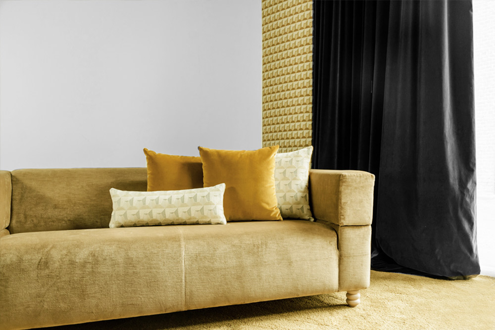
As rooms in Yellow, are rooms of good humour! Rooms that seem even amplified in size thanks to this positive colour.
 
Yellow has an enveloping effect and reacts very well to light, absorbing it in any shade.
 
There are many different shades of yellow, here we propose some of them particularly interesting for their history and for how they have been used.
 

Il Giallolino It is a shade of yellow that appears for the first time in Florence around 1300 used by Giotto and then by Tiziano, Tintoretto, Rembrandt up to Rubens - in the famous double portrait of him and his wife.
It is a colour that dominates, unchallenged, in the art world between the 1400 and the 1700.
Also known as lead and tin yellow, it was rediscovered around 1940 by Richard Jacobi who, analysing various paintings, frequently found traces of lead in the yellow colour.
Intrigued, he tries to recreate the colour discovering that by combining three parts of lead monoxide with a part of tin dioxide, depending on the heating temperature, you get a colour that varies from more reddish shades to lemon yellow.

Yellow chrome
The summer of 1888 was the happiest in Vincent Van Gogh’s life; he lived in Arles, in the yellow house, waiting for his friend Paul Gauguin. In the meantime, he dedicated himself to the creation of the famous series of paintings of the Sunflowers.
At that time, painters already had saturated and beautiful reds and blues, but they did not have a yellow that was up to the task yet.
The Yellow Chrome arrived just in time and Van Gogh fell in love with it. Its discovery is due to the discovery of a bright red crystal in the gold mine of Beresof in Siberia in 1762: the crocoite, which contained an element that will be what specifies this shade of yellow: chrome.
The negative aspect of this colour, unfortunately, is that "aging" it rusts while darkening, which is what is happening to the wonderful Van Gogh’s Sunflowers.

Imperial Yellow
It’s a colour with a fascinating history. On August 5, 1903, Katharina Augusta Carl was in the throne room in the Forbidden City in front of the Empress Mother Cixi. Her task was to make the portrait of the Empress using one of the colours strictly reserved for the imperial family, namely red-gold yellow.
The robe worn by the Empress was in imperial yellow silk. In China, in fact, yellow had represented royalty for more than a thousand years.
Along with red, green-blue, black and white was one of the five colours of the Five Elements theory.
The yellow was associated with the earth, the centre, the long and late summer, the dragon and those in charge.
 

Gold
Talking about gold in arts, how not to think about the famous portrait of Adele Bloch-Bauer immortalized by Gustav Klimt in 1907, a painting at the centre of a legal diatribe for a long time, now exhibited at the Neue Galerie in Manhattan.
Gold has always been the colour of reverence, the one that is given and the one that is claimed for itself, used to arouse awe and admiration.
In addition, the shimmer of gold makes it an easy emblem of divinity. How can we forget Giotto’s altarpiece created for the church of Ognissanti, where the figures are resting on a beautiful gold background!
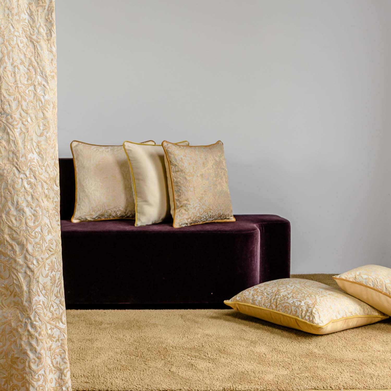
To conclude, in summary, here other shades of Yellow of which we have not spoken and with a strange name, like the Indian Yellow (fruit of the trades and the English empire in the Indies), the Acid Yellow (resulting from the rave culture), the Naples Yellow (discovered in an ancient German pharmacy of Darmstadt), the Gommagutta (coming from India, is the solidified resin of the Garcinia trees) and the Orpimento (an arsenic sulfide in which 60% is arsenic).

To the next appointment dedicated to colours!

HOME SET

With the new SETS you won’t have problem anymore!
You have just to chose the se you like. Or select the single pieces perfect for your interior among the ones proposed in the SET and combine them as you like. A total service!
 
DISCOVER COLLECTION

FUNKY

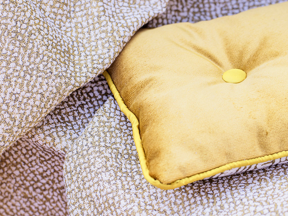
Elegant multitasking cloth in a jacquard fabric, a refined and welcoming touch for your interior.
DISCOVER COLLECTION

Articles

divisore

Torino Art Week 2024


Fabric Tells the Story of Home Life


l’Opificio workshop in Rome with Bludiprussia and Oscalito