We continue our journey discovering colors that, remember, are nothing more than light, photons that our brain transforms into virtual perceptions, emotions that can stimulate positive or negative energies.
The use of color in interior design goes beyond the harmony that a well-composed palette can convey.
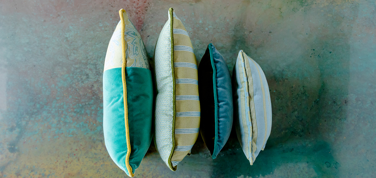
Green, in particular, is a really wonderful color, powerful and full of positive vibrations.
In all its facets and shades, the green conveys a feeling of health and well-being, recalling the plant world and nature.
Green contributes to balance, harmony, hope and serenity making us feel more confident in mastering situations.
Relatively less used in our interiors, it can transform a room and make it a stimulating place, helping us both to regenerate and to be productive.
It’s time for green!
A research published by Time in March 2021 points out that there is a need to bring nature and the landscape back into the home.
Furthermore, another study by the Interior Design at University of Arts London highlighted how the use of colors that recall vegetation and water will be greatly loved: green, light blue and blue in all shades.
In general, houses are becoming more colorful and joyful, but what we still need, above all, is calm, neutrality and naturalness. This is why the interior design proposals introduce a lot of sunlight and natural accents to the interior, so that our apartments remain a place of optimism, naturality and relaxation.
Style suggestions
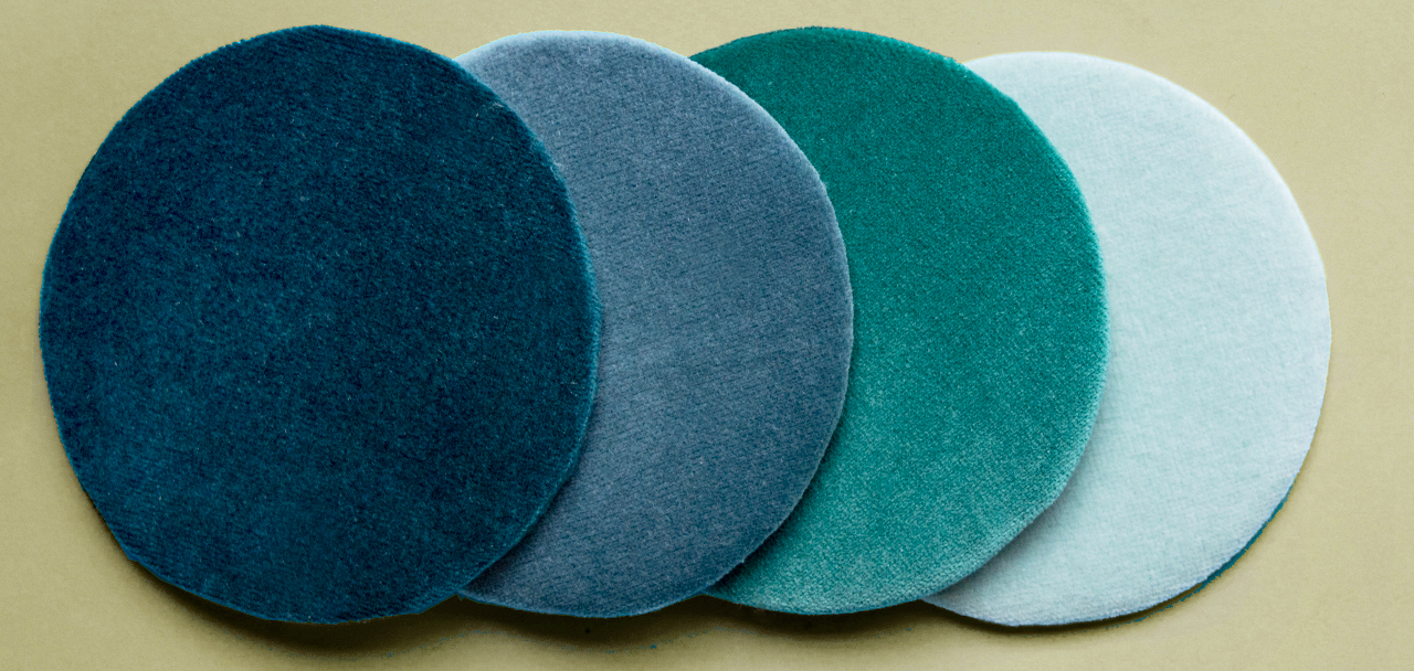
The advice is to look for greens that are neither too light nor too dark.
An excessively light green is easily contaminated by the surrounding colors and may look very different from how it was intended varying the light or if combined with a red too strong.
On the other hand, a very dark green can induce an uncomfortable note in the atmosphere, such as a hint of discomfort.
Chosen properly, however, this color can become a significant resource of energy and contribute to a state of greater well-being.
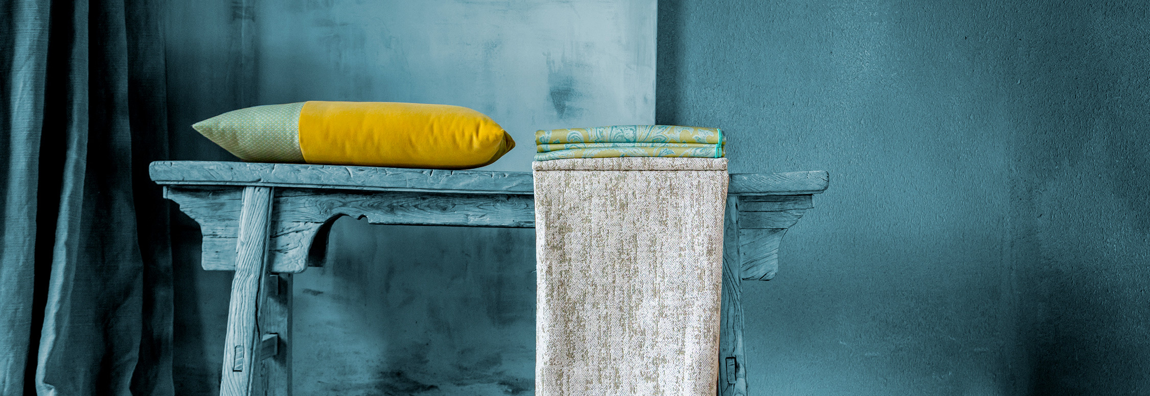
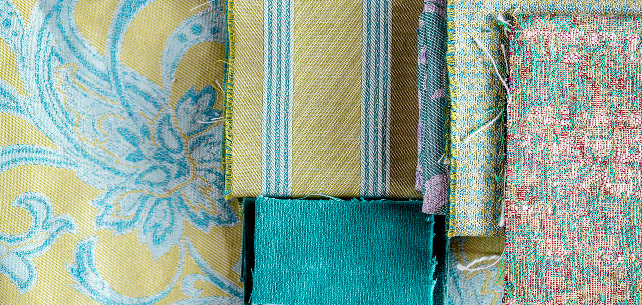
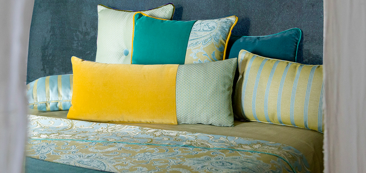
We choose shades inspired by natural green: from olive to sage, eucalyptus and mint. Green is becoming a neutral color, on which you can base an entire interior design project.
A lot of green comes with the biophilic style, "love for nature", which has the goal of inserting nature in our environment, both at home and workplace, which prefers a mix of shades from the earth moss, pine and ferns.
In general, matching possibilities are mainly two:
- 1. MONOCHROME, maintaining the same level of colour intensity,
- 2. RULE OF CROSSING, where I find the matching for color, "cut" by another color.
For example, we can combine a light green, which suggests freshness, vivacity and creativity, with white. The visual effect is pleasantly cold, comparable to the taste of mint.